


Suomenkielinen versio löytyy täältä.
There is many different ways of coloring and also different styles to use distress inks.
Today I am going to show you how I do it. I have tried some other refill inks but found out that Tim Holtz distress refills works for me.
Please notice that I am not an expert or artist and have no studies of art. I just love the coloring and the strong colors you can get with the inks. I think that when you do it a lot you can improve. Some are better in the beginning but everyone can improve by practicing.
Nowadays I check out all the colored images in the newspapers and magazine, I examine how the picture is done and where are the shades. Most of the children books are colored very beautifully and you can learn many things from there just look carefully the pictures. My daughter finds it difficult when I am reading her the story and keep steering the pics too long. She keeps saying:” Mom…. could PLEASE continue…”
You can use inks many ways. You can blend the colors to get more shades; you can put the color on a plate, on a cd-case or laminate the color chart to get the plate. I have used a plastic try where I take a zip of ink.
I do not normally blend the colors on a tray; I do the blending on the paper.
I start with the light color and keep adding layers to get stronger and stronger colors.
You get more living look when you add some other color, like when you are coloring red area, add a little orange or yellow to the lighter area. I have done this in the pictures below.
Here is one example how you can use the inks. Take a cd-case and print the color chart which you can attach on the bottom of the case. Then put small drops on each color. You need only small amounts.

Here are the tools I normally use when coloring with inks:

Based on the feedback I have got the light and shades seem to be the most difficult thing when coloring. I try to decide what is the direction from where the light comes.
Example here is the brush showing the light.
All that are in front are lighter and things staying behind are darker.
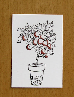
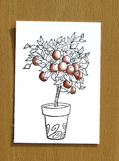
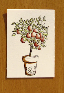
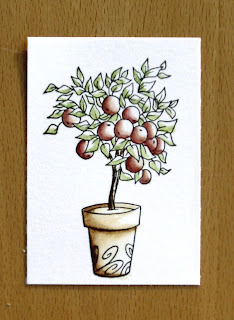
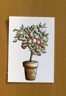
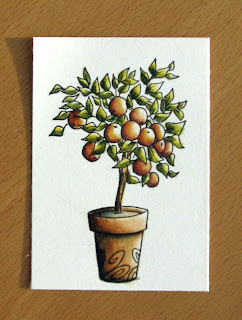
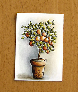
Here are different pictures step by step, which shows how it goes:

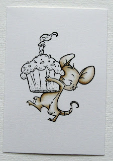
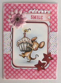
Here is another example, using Henry the mouse:


And the finished card:
***
If you would like to have a lighter color just add some water.

***
For the faces I normally use tattered rose and for the shades tea dye or vintage photo.
Shades on the clothes I make with vintage photo, blue shades or black.
Shades on the clothes I make with vintage photo, blue shades or black.


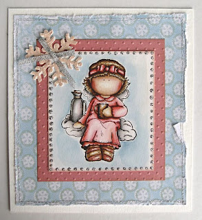
Finished card:
Some more examples on how I layer colors in:


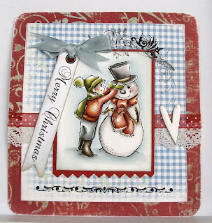
Finished card:
Want another example?
Here it is:
Here it is:


Here is the plate I normally use, a plastic tray:

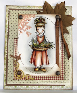
Finished card:
Hopefully you have had some inspiration from this tutorial.
When I tried distress inks for the first time it felt very difficult.
I thought that this was not for me at all. I thought to give it a second chance and the result was little better. So just keep on trying and practicing.
When I tried distress inks for the first time it felt very difficult.
I thought that this was not for me at all. I thought to give it a second chance and the result was little better. So just keep on trying and practicing.


0 Response to 'Distress tutorial by Aija!'
Post a Comment